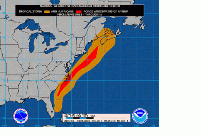
Some days before Hurricane Arthur hit North Carolina coast on 4 July 2014, the US National Hurricane Center (NHC) posted a forecast map on their web site, enhancing preparedness for the storm surge. This so called Potential Storm Surge Flooding Map predicted the location and severity of the surge.
It was the first time, that the Center had used this tool. The map shows different storm surge water levels in varying colors, showing how high goods should be moved off the ground to prevent water damage and even predicting where the hardest hit places could be. To ensure that everyone can understand the maps easily, social scientists and communications experts helped the team, and all of the features were tested in focus groups.
The new tool was developed after Hurricane Isabel (2003) and Ike (2008) had shown how hard it is to communicate storm surge warnings. The severe consequence of this miscommunication is, as data shows, that the majority of the people who die in a hurricane die from drowning.
The fact that there were no known deaths or even serious injuries linked to Hurricane Arthur would represent a real measure of success of the storm surge maps. According to Jamie Rhome, storm surge team lead for the NHC, one of the main reasons could have been the availability of the storm surge maps.
The forecast maps are still experimental. They will be presented only on the NHC Web site and will be refined over the next one or two years. Then, if considered successful, the Hurricane Center will make it a standard feature and share it more widely.

