Content:
Step 7: Linear Conversion to/from dB
Step 11: Open the GeoTIFF in QGIS
Step 13: Delete all polygons with DN of 0
Step 14: Downloading and opening transportation network vector data
Step 15: Select road network by destruction polygons
Step 1: Data access
The data used for this methodology comes from the Copernicus Data Space Ecosystem (https://dataspace.copernicus.eu/) satellite imagery of the European Union Copernicus programme. Note that free registration is required.
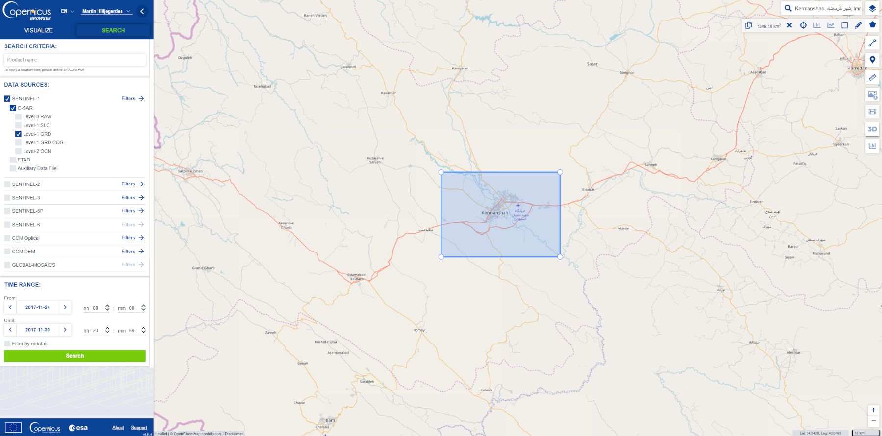
Figure 1: Copernicus Data Space Ecosystem search panel
Draw a polygon for your area of interest by using the tool on the top right. Search for Sentinel-1 data by selecting Sentinel-1 in the data sources and then select the options from the dropdown menu as shown in Figure 1.
Search for your data by selecting a time range directly before the incident. Select and download your ‘before’ data. Repeat these steps by filling out the search options according to Figure 1 again. Select a “time range directly after the incident. Select and download your ‘after’ data. Sentinel-1 Satellites have a combined exact repeat cycle of 6-days. The actual repeat cycle for your area of interest may differ by a few days depending on the location on Earth, your selected date range should allow for enough time to ensure a pass (12 days or so) and be close enough to the event date to ensure the damage is detected.
Once you have selected your data, but before downloading, it is important to check in the “Product Details” menu that both before and after data are matching in their orbits (ascending or descending). It is also important to check that the same polarization is available both before and after data sets. You can find this information by selecting the desired product and clicking the "i" icon. For better results, the orbit path should match as well. (See figure 2)
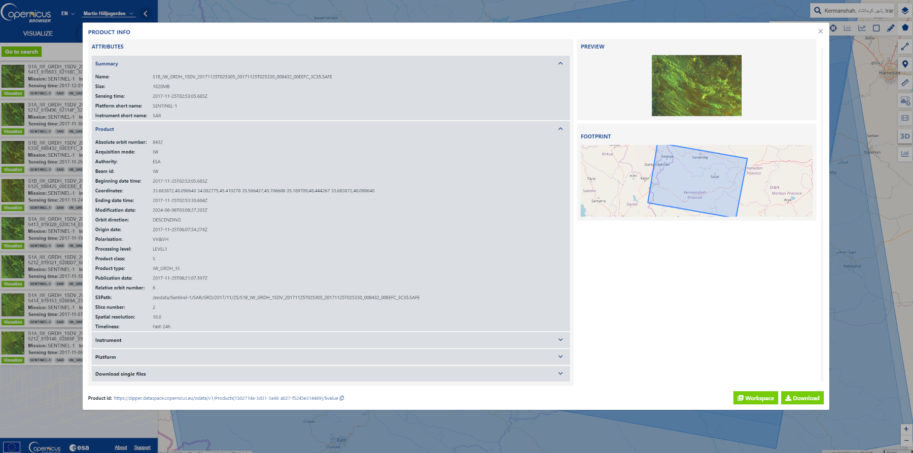
Figure 2: Product details information on Copernicus Data Space Ecosystem
For this Recommended Practice the data files used from the Copernicus Open Access Hub are as follows:
Before earthquake
S1A_IW_GRDH_1SDV_20171107T025349_20171107T025414_019153_02069A_232D
After earthquake
S1B_IW_GRDH_1SDV_20171125T025305_20171125T025330_008432_00EEFC_3C35
Step 2: Create a subset
To focus the analysis on the area of interest, reduce errors and increase processing speed a subset is required.
To clip the data to our area of interest, open the before and after zipped datasets you’ve downloaded into SNAP by selecting the  icon and navigating to the zipped file downloaded from Copernicus Open Access Hub.
In the “Product Explorer” window, navigate the drop-down options from your newly opened files and open the ‘Bands’ folder and double-click either “amplitude_VV” or “intensity_VV” for both before and after data. The “intensity” band will often give better and more pronounced results in this Recommended Practice.
Doing this will create a visualization of the data in the main SNAP viewer. (See Figure 3)
Go to “View” in your menu bar and check “Synchronise Image Views” from the drop-down menu. After this, use the “Navigation” panel in the bottom-right corner of SNAP to zoom to the urban region of interest in the main viewer.
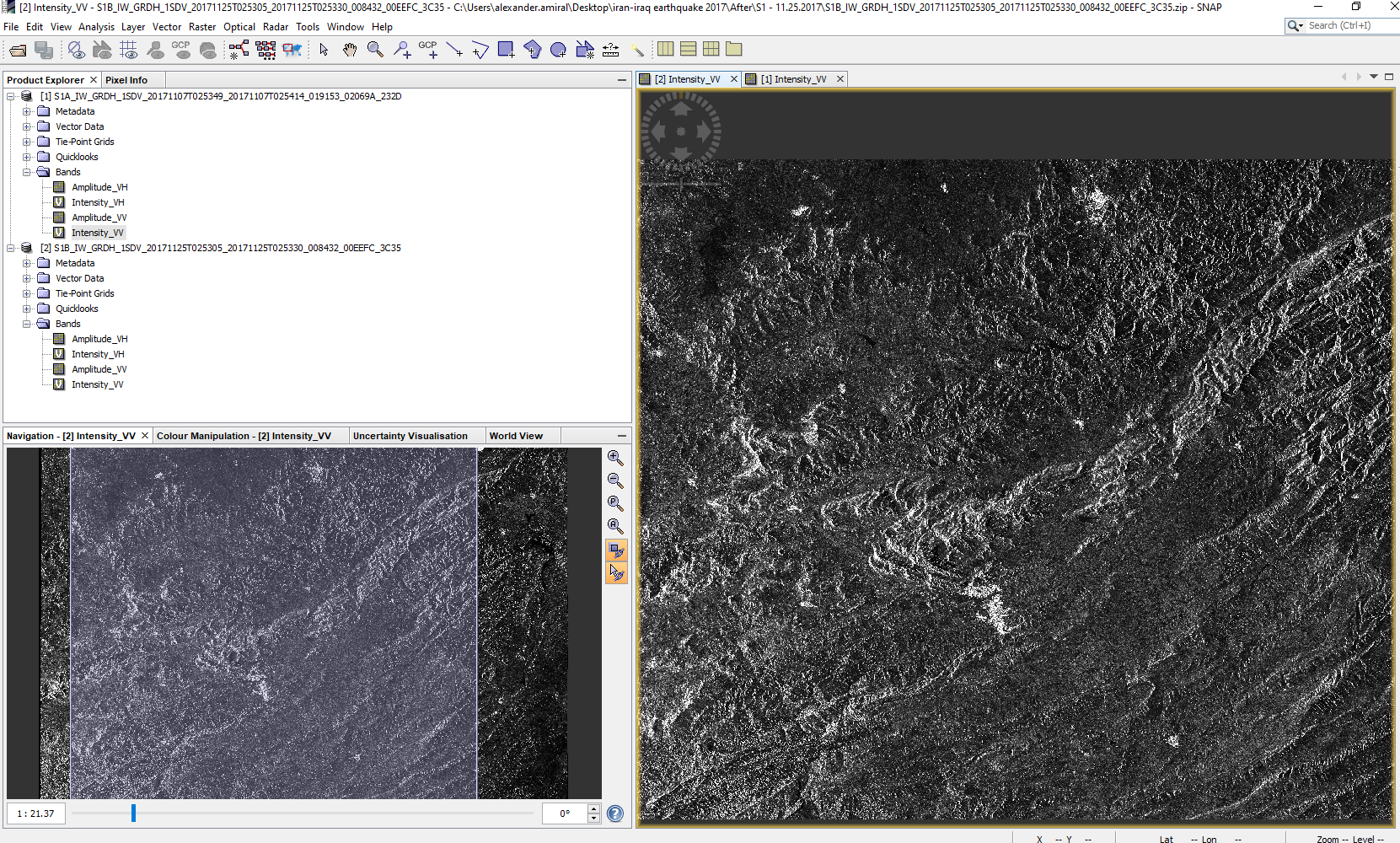
Figure 3: Data visualization in SNAP
Zoom so that the region of interest fills fully the main SNAP viewer. (See Figure 4) As “Synchronise Image Views” has been activated the zoom will be applied to both of your open data sets.
Right-click on the image visualization in the main viewer and select “Spatial Subset from View”; press “OK” without changing any options in the pop-up window. This will create a new data file, a subset of the data which you are viewing. Repeat this step with your second data set open. Right-click on the two new data files created, which start with “[3]” and “[4]”, select “Save Product As” (this will warn you that the files will be saved as BEAM-DIMMAP format, select “yes”) and choose a folder to save your before and after subsets in. This will allow you to close the original data folders which start with “[1]” and “[2]”, saving processing power and ensuring if your program crashes you’ll have access to your newly created subsets.
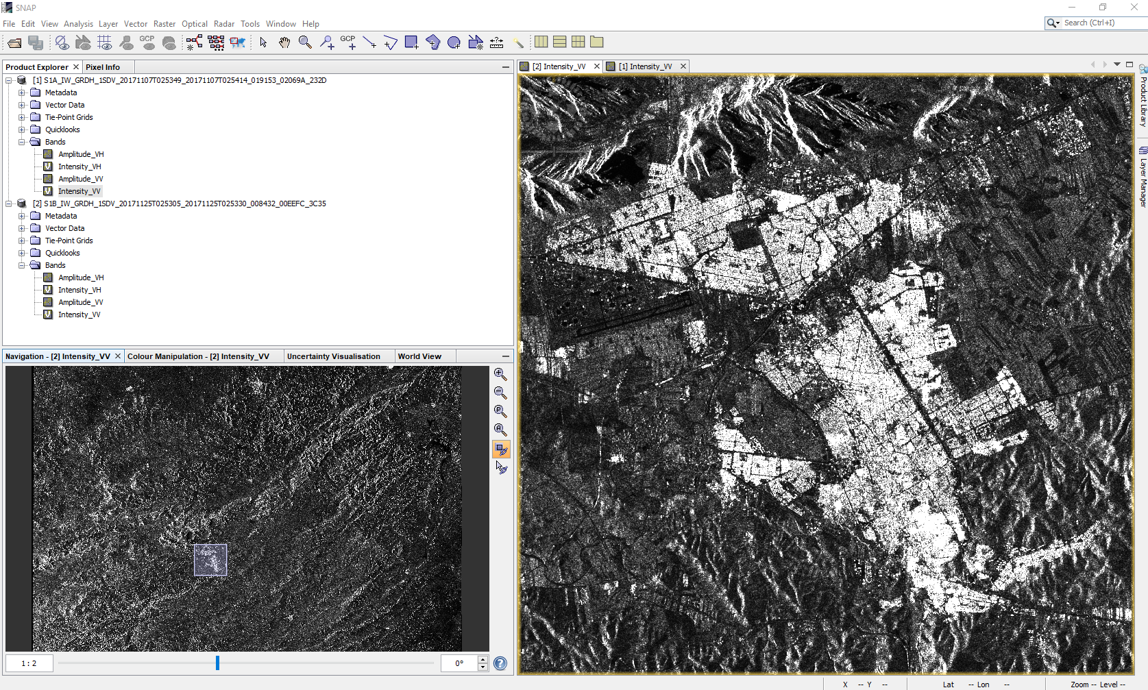
Figure 4: SNAP Subset view
Step 3: Apply Orbit File
This process must be applied to both images.
The orbit file contains relevant geographic information which this function will apply to the pixel information. The GNSS satellites track the position and altitude of the Sentinel-1 satellites, this information can be used to produce better results regarding the relative strength and position of the return signal that the satellite picks up. The Copernicus Precise Orbit Determination (POD) Service makes the precise orbit files available; the “Apply Orbit File” function in SNAP will download this file and apply it to the data. It is standard practice to apply the orbit file as the first step in any preprocessing methods. (Weiß, 2018)
From the menu bar select “Radar” > “Apply Orbit File”. Keep processing parameters as default and select “Run”.
Step 4: Calibration
This process must be applied to both images.
Radiometric calibration converts radar reflectivity, represented by raw satellite data numbers, into physical units measured in decibels (dB). The calibration function does this using a logarithmic function which standardizes the data and normalizes the distribution of data values, making it easily readable by computers and GIS software. This function does not alter the data but increases the contrast in the frequencies of the histogram, allowing a better handling of the data. (Miranda and Meadows, 2015)
From the menu bar select “Radar” > “Radiometric” > “Calibration”. Select the VV polarization from the processing parameters tab and leave “Output sigma0 band” checked, select “Run”.
Step 5: Speckle Filter
This process must be applied to both images.
Speckle filtering is a function that helps remove the inherent noise (aleatory pixels) from the radar data. There are a number of different algorithms which this tool can use to do this. Refined Lee is used in this Recommended Practice, this is an updated version of the well-known Lee process. (Yommy et al., 2015)
In the menu bar, go to “Radar” > “Speckle Filtering” > “Single Product Speckle Filter”. Select “Refined Lee” from the filter drop-down options and then “Run”.
Step 6: Terrain Correction
This process must be applied to both images.
In the remote sensing of SAR images, topographic distortions are introduced by elevated structures with surfaces facing the sensor that will send back a signal faster, and therefore be mistaken for being closer than they truly are. This creates the effect of ‘leaning’ or a small offset in the footprint of the measured area appearing as closer than it actually is. Terrain correction uses a digital elevation model (DEM) and the orbit information (applied in Step 3) to correct this.
Go to “Radar” > “Geometric” > “Terrain Correction” > “Range-Doppler Terrain Correction”. Leave processing Parameters as default and run.
Step 7: Linear Conversion to/from dB
This process must be applied to both images.
To further stretch the histogram of the resulting data, it is recommended to apply this data conversion tool. Similar to the calibration tool applied (step 4), this tool uses a second logarithmic function to better stretch the histogram of our data to a more manageable scale.
From the menu bar go to “Raster” > “Data Conversion” > “Converts bands to/from dB”. Leave processing parameters as default and run.
Step 8: Create stack
Now that we have finished fixing errors and making our data easier to analyze through logarithmic functions, we must stack our before and after data in order to compare the difference between the two.
In the menu bar go to “Radar” > “Coregistration” > “Stack tools” > “Create stack”.
From the pop-up menu populate your options be clicking  icon. With the newly populated list, highlight all but the last two data files. Click the
  This will leave only the last two data files created by Step 7. These are the files we want to stack. Click run. (See figure 5)
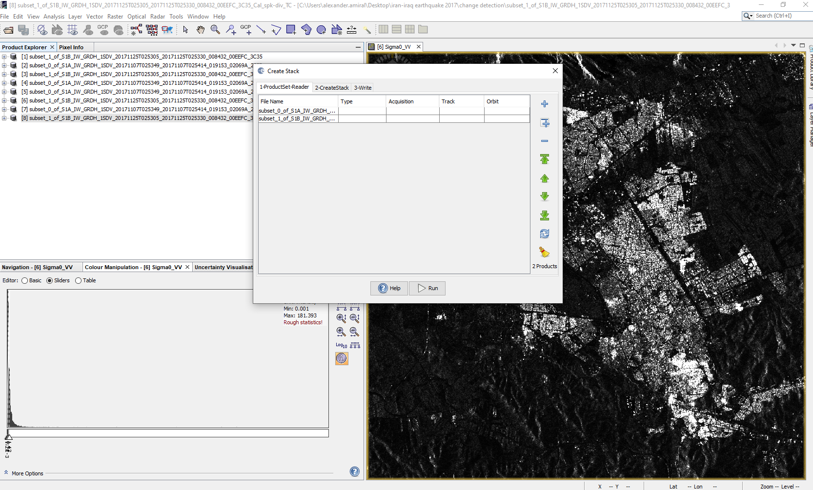
Figure 5: Create stack in SNAP
Step 9: Change detection
With our stacked file we can now run a change detection to highlight areas of major change (i.e. destruction).
From the menu bar go to “Radar” > “SAR Applications” > “Change Detection”. Use the newly stacked data as the input file. The default processing parameters should be sufficient; if the result of this step is inconclusive (if the results look like salt sprinkled over black paper), the threshold can be raised through trial and error. However, step 7 should allow the default maximum threshold value of 2.0 to be sufficient. Run the program.
The result will be a ratio band in which differences in the dB value from the before and after images are shown on a scale of 0 to 2. (See figure 6) Areas of high difference show up with a higher number (closer to 2) in this new layer. Images with no discernible difference will have a value of 0. Most of the image should have no difference, and high difference readings should be limited to areas of building collapse, areas of large vegetation which may have grown or areas with influx of water, snow or other physical change which would alter the return of the SAR energy. Vegetation and water changes will be considered errors for this Recommended Practice.
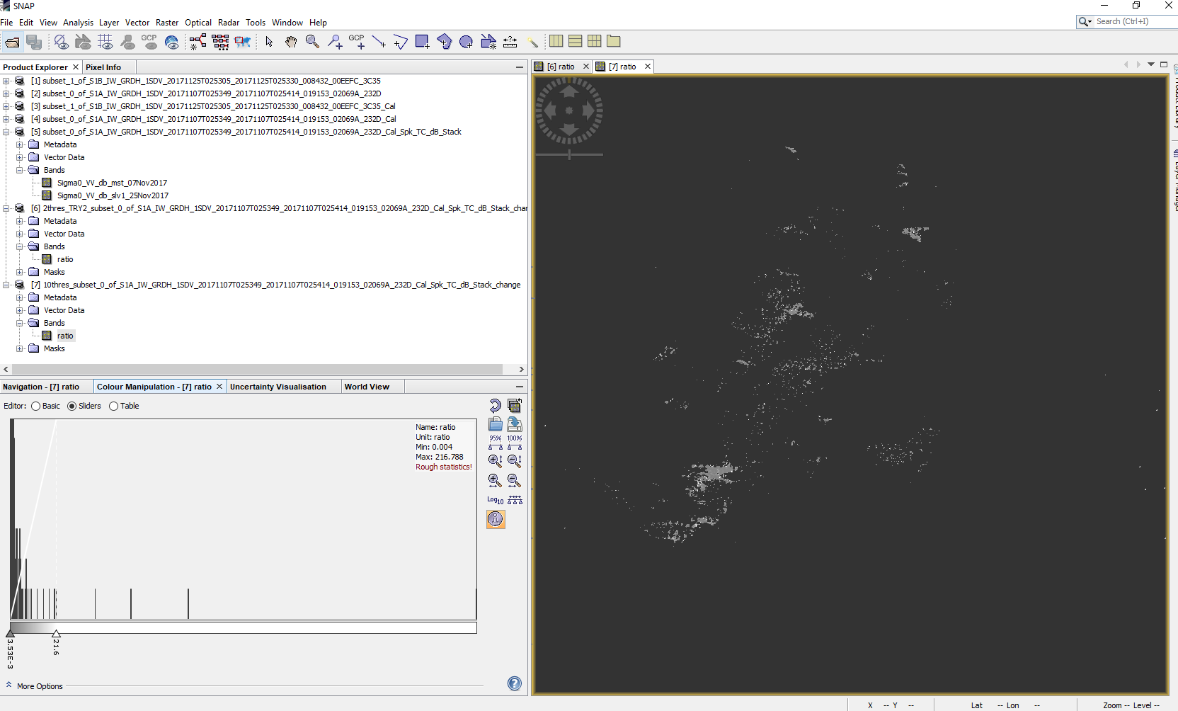
Figure 6: Change detection results in SNAP
This is the damage assessment results we will be working with.
Step 10: Export as GeoTIFF
The file now highlights areas of damage. We need to move this information from SNAP into QGIS for post-processing to produce valuable disaster management maps.
Highlight the data file name and in the menu bar go to File > Export > GeoTIFF. Save and name the file.
Step 11: Open the GeoTIFF in QGIS
In QGIS open the exported GeoTIFF. This layer may appear to be mostly black, as the symbology is stretching the colors from black to white over the entire range of the data set. The data may span from 0 to 200,000 or even higher. That data range is misleading however, since our change detection threshold was 2.
In QGIS Right-Click on the newly opened layer and select “Properties”. Navigate to “Symbology” in the panel. From the “Render Type” options change from “Singleband gray” to “Paletted/Unique Values”. Below the new box that was created in the “Paletted/Unique values” setting, click on the “Classify” button. This will create a color for each pixel corresponding to its change detection value in an evenly segmented range. Values of 0 are unchanged areas and the color for these pixels should be changed to 100% transparency to allow us to overlay our damage results on top of a map.
Once the symbology has been changed a coherent damage map should be displayed.
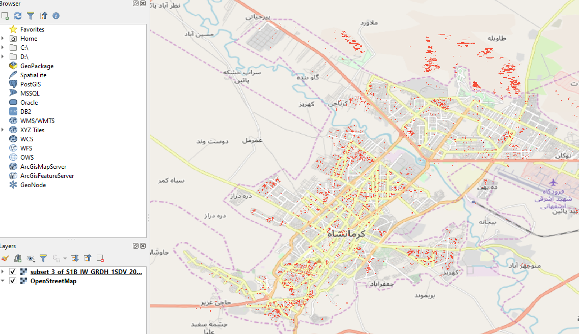
Figure 7: Change detection results opened in QGIS
The information created by a SAR change detection methodology can be used for a variety of disaster response operations. The data in QGIS can be overlaid with other forms of information such as hospital locations, housing areas, or neighborhood masks. This Recommended Practice will intersect the damage map with a road network map to highlight roads which may be blocked due to large amounts of debris.
Step 12: Vectorize Raster
In order to overlay the destruction data with other data types, the format needs to be converted from a raster data type to a polygon. This method will group all touching raster points into a polygon vector file. This type of file can interact with other shapefiles to create useful information.
In the QGIS menu bar go to “Raster” > “Conversion” > “Polygonize (Raster to Vector)”. Make sure the correct data file is selected for the input file and then run the program.
Step 13: Delete all polygons with DN of 0
In the new vectorized file, Right-click the layer and open the “Attribute Table”. Here there will be an entry for each polygon created. Select the  “Filter by expression” tool . In the “DN” field enter “0” and click “Select features” at the bottom of the window. This will highlight each part of the disaster map with no damage detection. In the top right corner, select
  the “Edit” tool and, with the polygons with a DN of 0 still selected, click
  the “Delete” tool. Then be sure to click
  the “Save Edits” tool and deselect the “Edit” tool.
This process will create the map in Figure 8. As areas with a DN of 0 indicate no change or destruction, doing this will ensure only areas with noticeable change between the before and after SAR images have polygons on the map. This process allows not only easier viewing of results, but also the ability to easily select other datasets by only polygons which indicate change or destroyed areas.
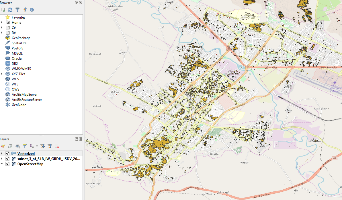
Figure 8: Polygonized destruction map
Step 14: Downloading and opening transportation network vector data
Open-source data is available for transportation networks across every country from a number of sources. The data used in this Recommended Practice is downloaded from Geofabrik Asia which has shapefiles (.SHP) available to download for every country in Asia. After downloading this zipped file, open the zipped file and select the gis_osm_roads_free_1.shp file from the available choices. This file is a network of all roads created by OpenStreetMap for the country.
NOTE: By right-clicking on the new layer and navigating to the “Properties” tab, under the “Information” section, the CRS can be viewed. It is important to ensure this new layer is the same CRS as the data you are working with. If the CRS is different, you will have to reproject the new layer.
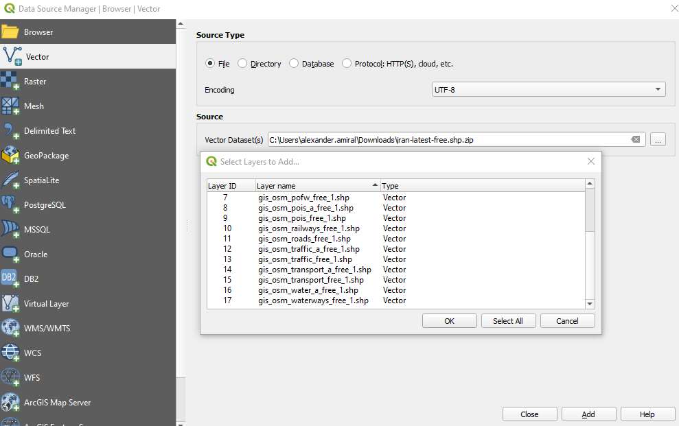
Figure 9: Open data source menu with available shapefiles to select
Step 15: Select road network by destruction polygons
In the QGIS menu bar go to “Vector” > “Geoprocessing tools” > “Clip”. In the dialogue box select the gis_osm_roads_free_1 layer as the input layer and select the vectorized destruction map as the overlay layer. Select run.
The resulting map will highlight areas of roads which have a high degree of probability for debris. (Figure 10) During the response phase of the emergency and disaster management framework, this map can be helpful to first responders and relief organizations in the hours and days following a disaster.
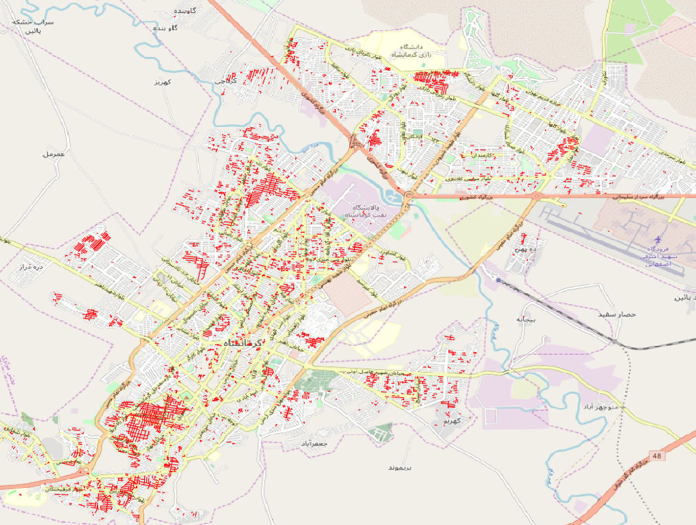
Figure 10: Road blockage map
The results of this Recommended Practice show one possible use for post-processing the data created. The data created by this SAR change-detection based urban infrastructure damage map in the “Processing” section of this Recommended Practice can be applied to other post-processing methods to create any number of digital and physical maps to be used for disaster response; instead of roads, the damage map can be overlaid with hospitals, schools or geospatially-linked income information to help stakeholders better understand those worst effected by disasters.
For more information regarding recommended steps for composing maps and displaying results such as those created in this Recommended Practice visit the section: “ADDITIONAL STEPS: Composing the map” section of the Burn Severity Mapping with QGIS Recommended Practice.